A business can improve mobile site speed by optimising images, reducing unnecessary code, and enabling caching. Slow mobile pages hurt search rankings and push potential customers straight to a competitor. For Australian business owners, that gap between a fast site and a slow one shows up directly in revenue.
Most website owners know it’s important, yet they’re not sure where to start. At Matter Solutions, we’ve worked with businesses across Australia to improve mobile speed, cut poor load times, and lift page speed performance where it counts.
This article covers:
- What slow mobile performance costs your business
- The core fixes that improve mobile page speed on any site
- Tools that improve mobile site speed without touching a line of code
- How to regularly monitor and maintain strong page speed scores
Keep reading to learn how to improve your website speed on mobile.
Mobile Speed and Business Performance: What Does the Data Show?
Mobile site speed affects how your business performs online, in search rankings and in revenue. In fact, if your mobile site takes more than three seconds to load, visitors begin to leave before reading a single word (and Google’s own data backs that up).
Poor mobile performance basically slows your business down. Here’s what the data shows:
- Abandoned Pages Cost Money: As we were saying, mobile users leave pages that take more than three seconds to load, and every additional second of delay cuts conversion rates by up to 20%.
- Rankings Drop Before Traffic Does: Google crawls and ranks your mobile pages before your desktop version under mobile-first indexing. This means a slow mobile site hits your search visibility well before you notice anything wrong.
- Fast Sites are Pulling Ahead: Only 33% of mobile pages pass Google’s Core Web Vitals assessment, compared to around 43% of desktop pages. Businesses that prioritise mobile page speed widen that gap in their favour.
Sites that load slowly lose ground in search results and with real visitors making real decisions. After all, even a short delay can reduce engagement and increase the likelihood of users leaving before taking action.
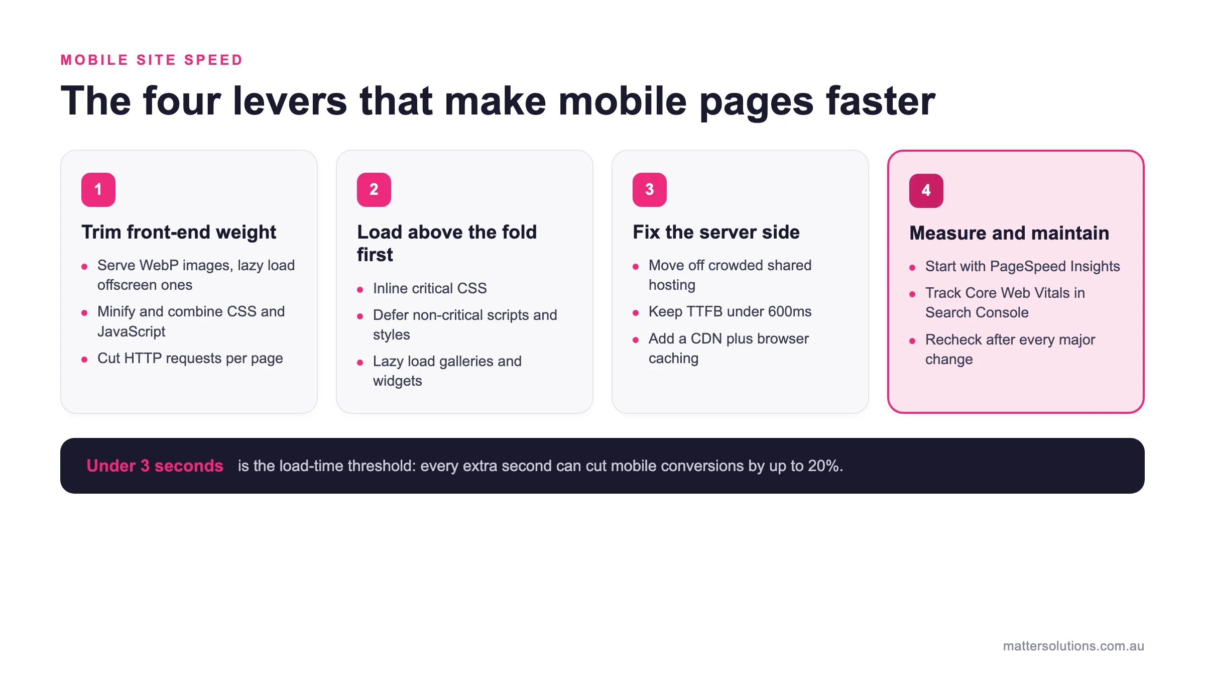
Mobile site speed
The four levers that make mobile pages faster
Trim front-end weight
- Serve WebP images, lazy load offscreen ones
- Minify and combine CSS and JavaScript
- Cut HTTP requests per page
Load above the fold first
- Inline critical CSS
- Defer non-critical scripts and styles
- Lazy load galleries and widgets
Fix the server side
- Move off crowded shared hosting
- Keep TTFB under 600ms
- Add a CDN plus browser caching
Measure and maintain
- Start with PageSpeed Insights
- Track Core Web Vitals in Search Console
- Recheck after every major change
Under 3 seconds is the load-time threshold: every extra second can cut mobile conversions by up to 20%.
The four areas that drive mobile page speed, from front-end weight through to ongoing measurement.
How to Improve Mobile Site Speed: The Core Fixes
A handful of targeted fixes can bring meaningful gains to your mobile page speed without a full site rebuild. These are the areas that move the needle most.
| Fix | What it does | Typical impact |
|---|---|---|
| Optimise images | Switch to WebP and lazy load offscreen images | WebP files are around 30% smaller than JPEGs with no visible quality loss |
| Trim code | Minify and combine CSS and JavaScript, remove unused scripts | Lighter pages and fewer bytes for mobile browsers to process |
| Cut HTTP requests | Audit third-party scripts and conditionally load page-specific assets | Less browser-to-server back-and-forth on weak mobile connections |
| Prioritise above the fold | Inline critical CSS and defer non-critical scripts and styles | First visible screen renders before the rest of the page loads |
| Improve server response | Move off crowded shared hosting and tune the configuration | Aim to keep Time to First Byte under 600ms |
| Add a CDN | Serve static files from the server closest to each visitor | Lower latency and stability during traffic spikes |
| Enable browser caching | Store static assets on the device with long expiry times | Returning visitors load pages without extra server requests |
Start With What Your Mobile Version Scores
The first step to improve loading speed is knowing where you stand. Google PageSpeed Insights gives your mobile version a score out of 100, broken into three bands:
- 0-49 is poor
- 50-89 needs improvement
- 90-100 is good
Scores below 50 point to serious performance problems that need attention right away. The report also tells you what’s dragging your site speed down, so you can fix the actual issues rather than guessing.
Even small improvements in your performance scores will start showing up in how your mobile pages rank and convert.
Optimise Images With WebP and Lazy Loading
From our experience auditing client websites, unoptimised images are a common cause of slow load times on mobile devices. In general, WebP images are roughly 30% smaller than JPEGs with no visible drop in quality, so switching formats alone reduces file sizes considerably.
On top of that, lazy loading defers offscreen images so the browser only loads what’s visible on screen first. That means your above-the-fold content loads faster, and visitors on slower mobile connections don’t wait for images they haven’t even scrolled to yet.
Pro Tip: To compress images at scale, tools like Smush or ShortPixel handle it automatically on upload, which saves a lot of manual work for larger sites.
Trim CSS Files, Scripts, and Unnecessary Code
Every line of unnecessary code adds weight to your mobile pages. Not to mention, browsers on mobile devices have less processing power than desktop machines to deal with it.
In this case, minifying CSS and JavaScript files strips out whitespace, comments, and line breaks that browsers don’t need to render the page correctly. Plus, unused non-essential scripts are worth removing entirely. They load on every page request regardless of whether they serve any function on that particular page.
Combining files where possible also reduces the number of HTTP requests the browser makes, which directly cuts load times across the board.
Cut Down HTTP Requests on Every Page
Every image, stylesheet, and script on your page provokes a separate HTTP request, and those requests add up on content-heavy mobile pages. Here, fewer requests mean less back-and-forth between the browser and the web server, so pages load faster on mobile devices with weaker connections.
A practical way to reduce them is to audit external resources regularly, particularly third-party scripts and tracking pixels that other tools drop onto your site over time. You can conditionally load the CSS code and JavaScript files that aren’t needed on specific pages instead of site-wide. This keeps each page’s request count lean without affecting functionality elsewhere.
Above the Fold Content: What Loads First and Why It’s Important
Above the fold content is the first thing a visitor sees when a mobile page opens, before they scroll anywhere. It loads before everything else on the page, and that’s why it’s important for mobile page speed.
This is how it can improve your website performance.
What Above the Fold Content Means for Mobile
Everything visible on screen before users scroll is above the fold content, and on mobile, that visible area is much smaller than on desktop. If that section loads slowly, visitors will leave before the rest of the page even renders, regardless of how good the content below is.
Poor mobile load times at this stage hurt desktop performance too, since Google measures both. Responsive design principles play a role here as well, since a layout built with CSS media queries can control what loads first on smaller screens.
How to Prioritise It Without Breaking Your Layout
An effective approach is to inline critical CSS so above the fold content can render without waiting for full external stylesheets to load. Along with that, non-critical scripts and styles should be deferred sooner rather than later. They only add to load times without contributing anything to what the visitor sees first.
Website content that sits below the fold, like image galleries or interactive elements, can be lazy loaded instead, which keeps the initial page load tight.
We suggest using Google’s URL testing tool to confirm your layout holds up across different screen sizes. You can also check that your mobile browsing experience matches what responsive design principles promise on paper.
Server Response Time: The Speed Problem Most Sites Ignore
Most site owners focus on design and content, but server response time quietly determines how fast any of that reaches a visitor. It’s one of those things that hides in plain sight. But when you fix it, every other mobile page speed improvement you make works better because of it.
Let’s see how it affects mobile speed.
What Causes a Slow Server Response Time?
Slow server response time usually involves a few common culprits: shared hosting, poorly optimised database queries, and weak server configuration.
Shared hosting puts your site on the same web server as hundreds of other sites, and when those sites spike in internet traffic, your load times suffer for it. A dedicated server or virtual private server removes that bottleneck entirely. It gives your mobile site consistent resources rather than whatever’s left over.
In this context, Time to First Byte (TTFB) is the metric that measures how long the server takes to respond to a browser request. As a rule of thumb, a TTFB above 600ms signals a server-level problem that directly lowers your PageSpeed score.
How a CDN Helps Reduce Server Response Time
A content delivery network stores copies of your website’s static files across multiple servers in different geographic locations. This way, visitors load content from whichever server is physically closest to them. That single change cuts latency, particularly for Australian businesses with visitors spread across different states or international markets.
Beyond just reducing server response time, a CDN (Content Delivery Network) absorbs traffic spikes too, so your mobile site stays stable under pressure rather than slowing down when it matters most.
For WordPress sites especially, pairing a CDN with a caching plugin covers both the delivery and the storage side of the problem at once.
WP Rocket and Tools That Improve Mobile Performance
You don’t need a developer to make meaningful gains in mobile performance. The right tools handle the heavy lifting, and several of them work across most content management systems without touching a single line of code.
- WP Rocket: WP Rocket handles caching, file minification, and lazy loading in one plugin. This makes it a practical option for WordPress sites looking to improve mobile page speed.
- Browser Caching: Caches store your website’s static files locally on a visitor’s device. So returning visitors load pages faster without the server serving everything from scratch again.
- GTmetrix and WebPageTest: Both tools show a full waterfall breakdown of exactly what loads, when it loads, and how long each asset takes. It gives you a better idea of where your mobile site speed is losing time.
- Asset CleanUp: This one reduces HTTP requests on pages that don’t need those external resources at all. It takes a different approach and lets you limit plugins and remove page-specific scripts and styles that other plugins load site-wide.
A lean combination of two or three focused plugins, each handling a specific job, outperforms any single all-in-one tool. There’s less overlap, minimal bloat, and lower risk of one plugin undoing what another is trying to fix.
Browser Caching and What It Does for Load Speed
Browser caching saves files like CSS, images, and scripts directly in the user’s device storage after their first visit. On repeat visits, the browser pulls those cached resources locally rather than fetching them from the web server again, which cuts load times.
Enabling browser caching for static assets with long expiry times allows returning visitors to experience noticeably faster mobile pages without any extra server requests. From what we’ve seen working with Australian business websites, this single change often produces immediate improvement in overall page speed scores.
How to Regularly Monitor and Improve Mobile Page Speed
A website can maintain strong mobile performance by regularly testing page speed, monitoring Core Web Vitals, and fixing issues as they arise. Mobile page speed isn’t a one-time fix, after all. Sites often shift, plugins update, and new content goes live, so performance scores on mobile pages change frequently.
This is how you can maintain accelerated mobile pages.
PageSpeed Insights and Google Search Console: Where to Start
Google PageSpeed Insights scores your mobile site and flags specific opportunities to improve. This is broken down by impact, so you know which fixes are worth prioritising first.
Google Search Console takes it further by pulling real-user data from actual users across your whole site. It does so through its Core Web Vitals report, rather than just lab data from a single test.
Between the two tools, you get a clear idea of how your mobile pages perform for real visitors on real mobile devices. From there, the Chrome User Experience Report feeds into both, so the field data you’ll see reflects genuine mobile browsing conditions rather than simulated ones.
How Often Should You Check Mobile Performance?
Run a check after every major site update, plugin change, or new content push, since those are the moments most likely to introduce new performance problems. Monthly checks along with those catch gradual slowdowns that don’t show up as sudden drops, particularly on sites with frequent content updates.
Having worked on mobile performance audits for clients across Brisbane, slow server response time and bloated page loads are almost always the culprits behind unexpected score drops.
Quick Tip: Set up automated alerts in Google Search Console for Core Web Vitals failures. That way, problems will surface right away rather than sitting unnoticed for weeks.
Your Faster Site Starts Here
Mobile site speed covers a lot of ground, such as optimising images, reducing HTTP requests, fixing server response time, and keeping Core Web Vitals scores where they need to be. The good news is, most of these fixes are actionable with the right tools and a clear starting point.
A PageSpeed Insights audit is the best place to begin, since it shows where your mobile pages are losing speed rather than leaving you guessing. The sites that can effectively improve mobile performance are the ones that prioritise fixes by impact, instead of complexity.
That’s exactly the approach we take at Matter Solutions. If your site speed needs work, we’re ready to help. Get in touch with our team today and let’s build something faster.
FAQs About Mobile Site Speed
A few questions tend to come up time and again when businesses start looking at mobile page speed seriously. These are the ones worth knowing the answers to.
What Is a Good Mobile Page Speed Score?
A score of 90 or above on Google PageSpeed Insights is considered good. Scores between 50 and 89 need improvement, and anything below 50 points to serious performance problems affecting both user experience and search rankings.
Does Mobile Site Speed Affect SEO?
Yes, mobile site speed affects SEO directly. Google treats mobile page speed as a ranking factor under mobile-first indexing, and Core Web Vitals scores feed into how your mobile pages rank.
What Is the Fastest Way to Improve Mobile Page Speed?
Start with Google PageSpeed Insights to find the biggest issues. Optimising images, enabling browser caching, and reducing HTTP requests on your mobile site typically produce the quickest gains without major development work.
How Does a Content Delivery Network Improve Mobile Speed?
A content delivery network stores your website’s static files across multiple server locations. Mobile users load content from the nearest server. This cuts load times considerably for businesses with visitors spread across different regions.
What Are Core Web Vitals and Why Are They Important?
Core Web Vitals measure real-world mobile site performance across three areas. Those are Largest Contentful Paint (LCP) for load speed, Cumulative Layout Shift (CLS) for visual stability, and Interaction to Next Paint (INP) for responsiveness. Poor scores in these areas affect both mobile browsing experience and search rankings.
Need help with your digital marketing?
Book a free strategy call and let's discuss your goals.
Book a Strategy Call