If you have a website and want more customers to find you online, knowing how to optimise for mobile SEO is a good place to start. After all, without a site that works properly on a phone, you’re already losing ground to competitors who’ve sorted theirs out.
Our team at Matter Solutions has spent years helping Australian businesses improve their search performance across every device. And in this article, we’ll share our insights on what actually works, so you can stop guessing and start seeing results.
Here’s what you’ll find inside:
- Why mobile-first indexing changes everything for your rankings
- What makes a fast, user-friendly mobile experience
- How local search and voice search tie into mobile performance
- The most common mobile SEO mistakes and how to sidestep them
Ready? Let’s begin.
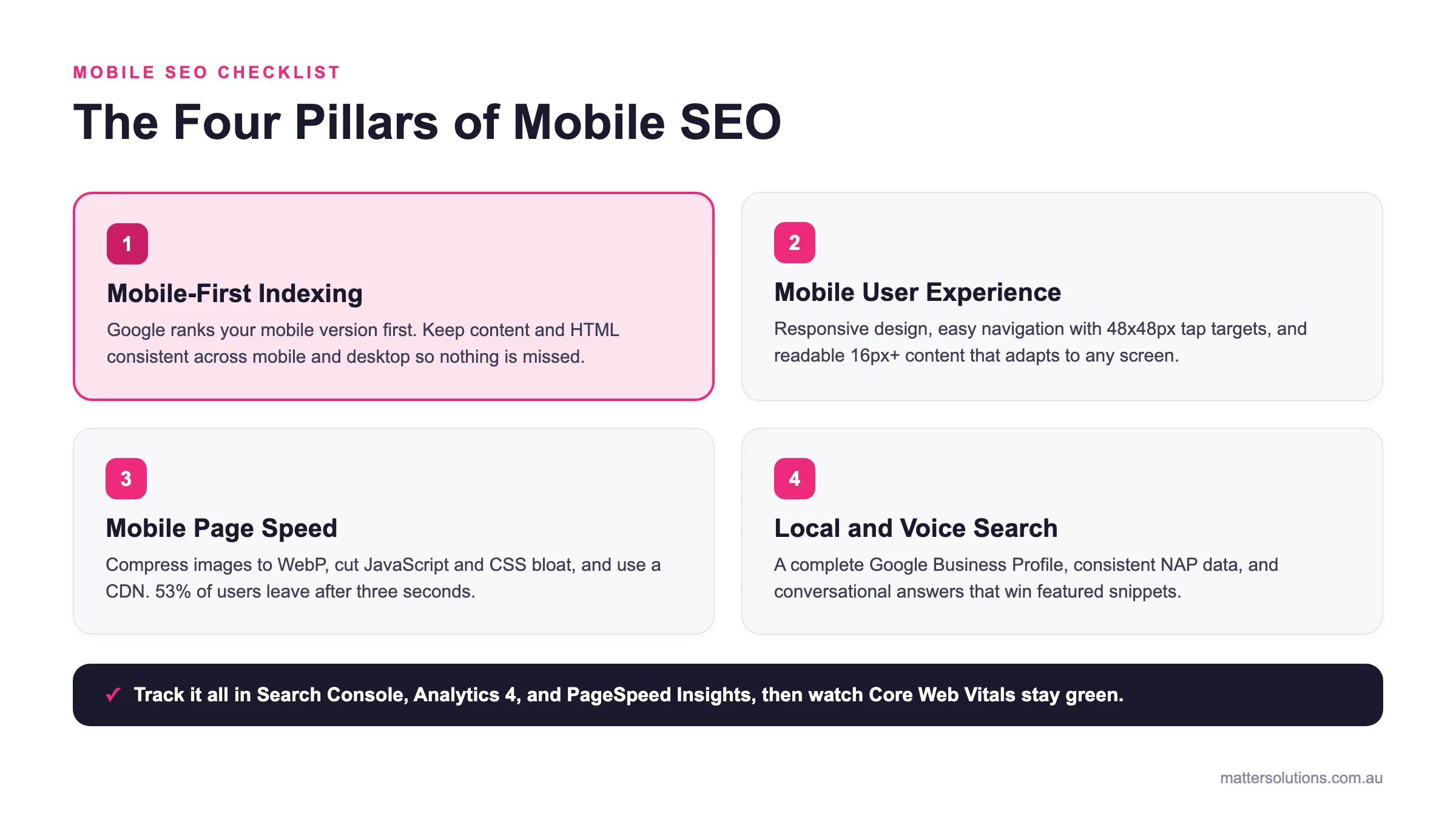
Mobile SEO checklist
The Four Pillars of Mobile SEO
Mobile-First Indexing
Google ranks your mobile version first. Keep content and HTML consistent across mobile and desktop so nothing is missed.
Mobile User Experience
Responsive design, easy navigation with 48x48px tap targets, and readable 16px+ content that adapts to any screen.
Mobile Page Speed
Compress images to WebP, cut JavaScript and CSS bloat, and use a CDN. 53% of users leave after three seconds.
Local and Voice Search
A complete Google Business Profile, consistent NAP data, and conversational answers that win featured snippets.
Track it all in Search Console, Analytics 4, and PageSpeed Insights, then watch Core Web Vitals stay green.
The four core areas of mobile SEO covered in this guide, from indexing to local and voice search.
What Is Mobile SEO?
Mobile search engine optimisation is the practice of optimising your website’s speed, structure, and content so it performs well on smartphones and tablets. In simple terms, it’s how you make sure your site ranks well and works properly when someone pulls it up on their phone.
Think about it this way: search engine optimisation (SEO) has moved well beyond desktop results. Mobile SEO covers everything from how fast your pages load to how easy your content is to read on a small screen.
In practice, a mobile-friendly site needs clean navigation, fast load times, and content that adapts to any screen size. Without these, your mobile website risks ranking lower, even if your desktop version looks great.
So what’s actually driving this shift? That comes down to how Google reads and ranks your site today.
Why Should Australian Businesses Care About Mobile SEO?
Nearly 60% of all web traffic now comes from mobile devices, yet plenty of Australian business websites are still built with desktop users in mind. That gap is costing businesses rankings, traffic, and leads they may not even realise they’re losing.
The two areas where this shows up most are your search rankings and how your audience behaves on a phone.
Your Rankings Depend on It
After years of working with Australian businesses on their SEO, we’ve seen how quickly rankings shift once mobile issues go unfixed.
One client came to us after losing 30% of their organic traffic over three months. The cause was a mobile layout breaking on mid-range Android devices, something their desktop testing had never picked up.
Small device-specific faults like that are easy to miss and surprisingly damaging when left alone. This gives businesses with strong mobile SEO a genuine edge over competitors who haven’t caught up yet. And that gap only widens over time.
Mobile Users Behave Differently
Mobile searchers tend to search with shorter, location-driven queries and make decisions more quickly than desktop users. On top of that, mobile traffic converts differently, too, so what works on a desktop site won’t always land the same way on a phone.
Now that you know why mobile SEO deserves attention, let’s get into how Google actually processes your site on mobile.
How Does Mobile-First Indexing Work?
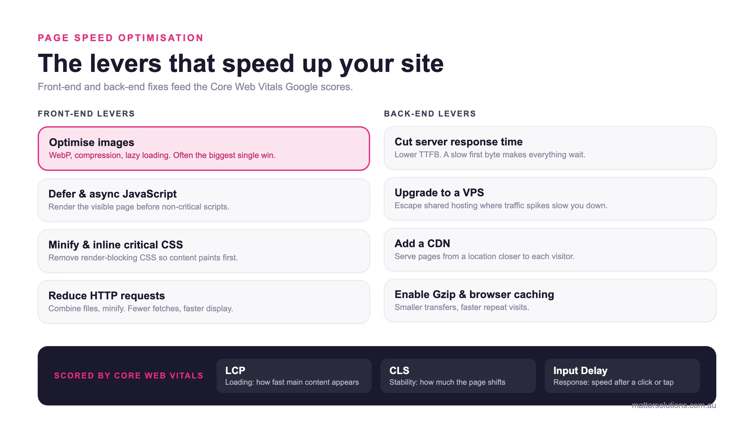
Google now ranks your site based on its mobile version, rather than desktop. That shift, known as mobile-first indexing, has been fully rolled out since 2023 (which explains why so many sites rank well on desktop but lose ground on mobile).
Basically, the platform sends Googlebot to crawl your mobile pages first. Whatever it finds there, including your content, images, and the same HTML code, is what determines your position in search results. That means if your desktop has content that your mobile site doesn’t, Google simply won’t see it.
With that in mind, a consistent mobile URL structure and matching content across both keep your site’s visibility intact.
What Makes a Good Mobile User Experience?
Ever landed on a site on your phone and left within seconds because nothing worked properly? That’s exactly the experience Google is trying to filter out of its rankings. And with mobile search growing year on year, the bar for what counts as a good experience keeps rising.
Below, we’ll cover three things that separate a site that keeps users engaged from one that drives them away.
1. Responsive Design
A responsive web design uses fluid grids and flexible images, so nothing breaks or overflows on smaller screens. Plus, a responsive site keeps all your content under a single URL, which avoids duplicate content issues and keeps your link equity intact.
Google explicitly recommends this setup over separate mobile and desktop versions, and mobile and tablet devices are precisely why that recommendation exists.
2. Easy Navigation
When mobile navigation is done well, users find what they need faster, stay longer, and are far more likely to convert.
To get there, mobile menus should use tap targets of at least 48×48 pixels to prevent accidental clicks. Beyond these basics, limit your top-level menu to five items or fewer so visitors aren’t overwhelmed.
A seamless user experience also means keeping a visible search bar and sticky header, which helps engage mobile users who’d otherwise leave after one confusing tap.
3. Readable Content
Readable mobile content comes down to font size, paragraph length, spacing, and contrast (small oversights here quietly drain traffic businesses never knew they had).
These details are worth getting right from the start:
- Font Size: Small fonts are genuinely hard to read on a phone, and most users won’t stick around to squint. Meanwhile, bumping it up to 16px or higher costs nothing and immediately improves readability across every device.
- Paragraph Length: Short paragraphs of two to three lines work far better for mobile content than the longer blocks suited to desktop reading. The more digestible your layout, the longer visitors stay on the page.
- Button Sizing: Test the buttons across different screen sizes before going live. This is one of the quickest ways to catch tap targets that frustrate users and hurt your usability score.
- Colour Contrast: Sometimes, the colour contrast that looks fine on a desktop monitor can become unreadable in bright sunlight on a phone screen. That’s why running your palette through a contrast checker is a step worth adding to every design review.
Getting these details right reduces bounce rate and keeps visitors moving through your pages. And when your site is easy to read, Google takes notice too.
Once the experience side is sorted, it’s time to tackle the technical factor that influences rankings more than almost anything else: speed.
How Do You Improve Mobile Page Speed?
According to Google, 53% of mobile users abandon a site if it takes longer than three seconds to load. That means page speed is one of the most direct levers you have on mobile performance, and cutting corners here shows up fast in both your rankings and bounce rate.
Follow these three steps to get it right.
Compress and Optimise Images
Without properly optimised images, even a well-built mobile site will load slowly and lose users before they get past the first scroll. In most cases, image size is the single biggest drag on mobile load time, and it’s also one of the easiest fixes available.
For starters, switching to WebP format reduces file size by up to 34% compared to JPEG without any visible quality drop. On top of that, lazy loading defers off-screen images from loading until the user scrolls to them, which cuts initial load time considerably.
Reduce JavaScript and CSS Bloat
If your pages are carrying unused JavaScript and CSS, you’re adding unnecessary load time. That extra weight hurts your page speed score and frustrates users before they’ve even seen your content.
Minifying and deferring non-critical scripts can shave seconds off on slower connections. Google PageSpeed Insights also flags render-blocking resources automatically. This makes it easy to spot what needs fixing first without digging through code manually (even a non-technical business owner can action this one).
Accelerated mobile pages are another option worth exploring for content-heavy sites, as they strip page elements down to the bare minimum for near-instant loading.
Use a Content Delivery Network (CDN)
A CDN speeds up your site by serving pages from a server closer to each user. For Australian businesses with a national audience, that means faster load times, lower latency, and fewer users dropping off before your page fully appears.
What’s more, a CDN keeps your sites performing consistently during traffic spikes by distributing the load across multiple servers. Your mobile SEO efforts aren’t undone by a slow server on a busy day.
How Does Mobile SEO Compare to Desktop SEO?
Most businesses assume their desktop SEO work carries straight over to mobile. In practice, the two have enough differences to warrant their own strategy.
Some of the key separators include:
- Search Intent: Mobile search queries tend to be shorter, location-driven, and action-oriented. Desktop users, on the other hand, lean toward longer research-based searches with less urgency behind them.
- Performance Standards: Mobile and desktop SEO are measured separately in Google Search Console (GSC), including Core Web Vitals scores. A desktop site can pass cleanly while the mobile version fails, and your rankings will reflect that gap.
- Content Format: Desktop and mobile audiences consume content differently. Longer paragraphs and complex layouts work on a wide screen, but the same page can feel overwhelming on a phone. So, concise and scannable content is the safer bet for mobile SEO strategies.
| Factor | Mobile SEO | Desktop SEO |
|---|---|---|
| Search intent | Shorter, location-driven, action-oriented queries with urgency behind them. | Longer, research-based searches with less urgency. |
| Performance standards | Measured separately in Search Console, including its own Core Web Vitals scores. | Can pass cleanly even while the mobile version fails. |
| Content format | Concise, scannable content with short paragraphs suits small screens. | Longer paragraphs and complex layouts work on a wide screen. |
Understanding these differences helps you build strategies that account for how each audience behaves on their device. After all, the same user can search for your business on both a phone and a laptop and have a completely different experience each time.
Local search is where mobile behaviour gets even more specific, and it’s an area where small businesses can gain real ground more quickly.
How Does Local SEO Connect to Mobile Performance?
Local SEO and mobile SEO are closely linked because most location-based searches happen on phones. When someone types “café near me” or “plumber in Brisbane,” they’re almost always on a mobile device (and they usually want an answer in the next few minutes). Once they hit search, Google serves results based on proximity, relevance, and how well your local presence is set up.
The strongest starting point is your Google Business Profile. Based on our firsthand experience, businesses with a complete and active profile consistently outperform competitors in local search results. To rank well there, your profile needs:
- Accurate contact details
- Updated hours
- Recent photos
- Genuine customer reviews
Keep an eye on your NAP data, too, which stands for name, address, and phone number. Consistent NAP information across every directory and listing strengthens your local search visibility and tells Google your business details are trustworthy.
What Is Voice Search Optimisation and Why Should You Care?
Voice search is how people speak a question directly into their phone or device and get an instant spoken answer back. It’s now a daily habit for millions of Australians, whether they’re asking Google Assistant for directions, looking up a restaurant, or finding a local service provider on the go.
In short, mobile voice search optimisation is the process of making your content easy for search engines to pull as a spoken answer. And usually, spoken queries are longer and more conversational than typed ones. Someone typing might enter “SEO agency Brisbane,” but the same person speaking might ask, “What’s the best SEO agency in Brisbane for small businesses?”
That shift changes how you write content. Pages that answer specific questions clearly, use natural language, and load fast are far more likely to appear as a spoken result on a search engine.
Optimising for this also overlaps heavily with featured snippets. Because Google Assistant and similar tools typically read out the top snippet, structured and concise answers near the top of your page give you the best shot at that position.
Voice search queries are only getting more common, so the earlier you optimise, the better.
What Are the Biggest Mobile SEO Mistakes to Avoid?
Believe it or not, many businesses make the same mobile SEO mistakes repeatedly. They spend time and money optimising their site, then unknowingly undo that progress with a few common oversights.
The most frequent ones include:
Blocking CSS and JavaScript
If you don’t allow Googlebot to access your CSS and JavaScript, it can’t render your mobile pages correctly. Your rankings will take a direct hit as a result.
Basically, Googlebot needs to see exactly what your users see. Without that access, technical SEO issues build up quickly, and your mobile-friendly status in Google’s eyes drops considerably.
Helpful Tip: Check whether your pages are rendering properly using Search Console’s URL Inspection tool. It shows you precisely what Googlebot sees when it visits your site.
Using Intrusive Pop-Ups
Google actively penalises mobile pages that use pop-ups covering the main content on arrival. This means your rankings can slip even if everything else on the page is well optimised.
A retail client we worked with saw a 15% drop in mobile rankings within weeks of adding a full-screen newsletter pop-up. Once we helped them remove it, their user engagement recovered within a month.
If you still want to capture leads on mobile, there are perfectly acceptable alternatives. Instead of full-screen overlays, you can use small banner notifications, exit-intent triggers, or delayed pop-ups that only appear after a user has spent time on the page.
Ignoring Core Web Vitals
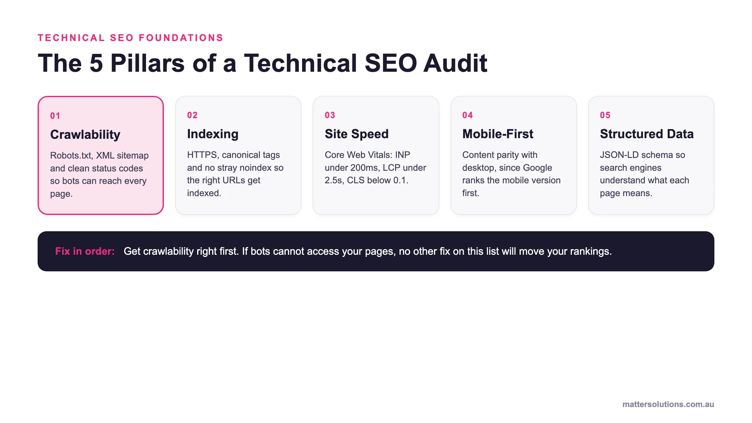
Core Web Vitals are Google’s three metrics for mobile page performance, and they’re a confirmed ranking signal. The three metrics, LCP, INP, and CLS, each measure a different aspect of how your pages feel to use on a phone.
- LCP (Largest Contentful Paint): Measures how long a page’s main content takes to appear on screen.
- INP (Interaction to Next Paint): Tracks how fast a page responds after a user taps or clicks.
- CLS (Cumulative Layout Shift): Captures how much the layout shifts around during loading.
Poor scores on any one of them affect your position in search engine results pages, so running regular checks in GSC keeps you ahead of any drops.
How Do You Track and Measure Mobile SEO Performance?
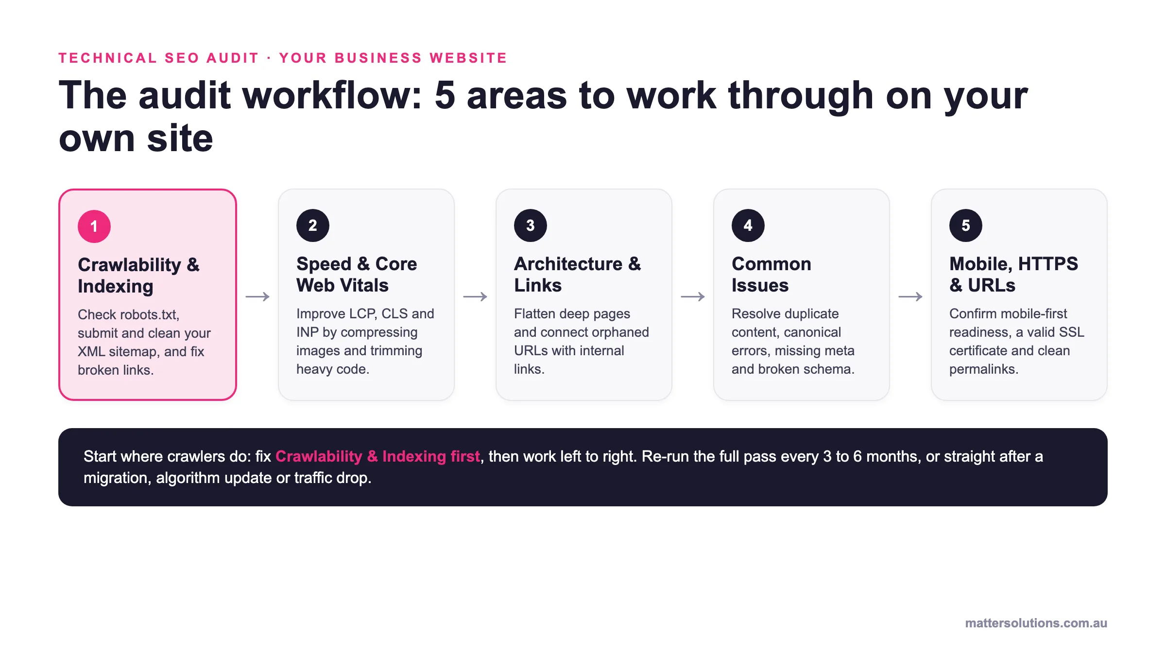
There are four tools worth knowing for mobile SEO tracking: Google Search Console, Google Analytics 4, PageSpeed Insights, and the URL Inspection Tool. Together, they give you a complete picture of how your site performs on mobile.
The table below breaks down what each one covers:
| Tool | What It Measures |
| Google Search Console | Mobile impressions, clicks, average position, and Core Web Vitals by device |
| Google Analytics 4 | Session duration, bounce rate, and conversion paths for mobile users |
| PageSpeed Insights | Mobile-specific speed scores and fix recommendations |
| URL Inspection Tool | How Googlebot renders and indexes individual mobile pages |
Honestly, checking all four regularly, rather than just when something feels off, is what separates businesses that stay ahead from those that scramble to recover.
What Is the Role of Structured Data in Mobile SEO?
Structured data is simply a block of code you add to your pages that tells Google exactly what your content is about, and the format it uses is called JSON-LD.
It sits in your page’s HTML and feeds Google the context it needs to display rich results. These include star ratings, FAQs, product prices, and business details, all appearing directly in mobile search results before a user even clicks through.
That visibility boost is especially significant on mobile. Because smaller screens show fewer results, rich snippets push your listing further up the visible area and drive higher click-through rates without needing to climb the rankings.
Businesses exploring app store optimisation also benefit from this approach, as this markup strengthens how your brand appears across multiple Google surfaces.
So naturally, placing your JSON-LD in server-rendered HTML rather than loading it through JavaScript ensures Googlebot picks it up reliably every time.
Ready to Make Mobile Work for You?
You’ve got the facts now. Mobile SEO covers a lot of ground, from page speed and responsive design to local search, structured data, and voice search optimisation. Fortunately, you don’t need to tackle all of it at once.
Start with the basics:
Start with the basics
Your mobile SEO starting checklist
- A mobile-friendly website
- Pages that load cleanly on every screen size
- A complete Google Business Profile
- Core Web Vitals scores that pass on mobile
These three alone drive more progress than a dozen technical fixes applied randomly. Beyond that, layer in best practices like Core Web Vitals monitoring and schema markup as your confidence grows.
At Matter Solutions, we’ve helped Australian businesses improve their SEO for mobile from the ground up since 2000. If you’re ready to stop losing ground to competitors on mobile devices, get in touch with our team today, and let’s build an SEO strategy that actually delivers.
FAQs
These are some of the questions we hear most often about mobile SEO:
Does Mobile SEO Affect App Store Optimisation?
Not directly, but the overlap is real. After all, a strong mobile presence, including fast load times and relevant keywords in your content, signals credibility to both Google and app store algorithms.
Businesses running mobile apps alongside a website benefit from aligning both strategies, as mobile search visibility and app discoverability often reinforce each other.
What Does Mobile Analytics Actually Tell You?
Mobile analytics shows how visitors behave specifically on smaller screens, including where they drop off, how long they stay, and which pages lose them fastest. This data is separate from desktop reporting and highlights mobile usability gaps that general analytics won’t surface on their own.
How Do You Optimise a Website for Mobile SERPs?
Optimising a website for mobile SERPs starts with important mobile SEO fundamentals: fast load times, clean structure, and content sized correctly for smaller screens.
Targeting conversational, location-based queries also helps your pages match how mobile users search, which directly lifts your position in search results.
Need help with your digital marketing?
Book a free strategy call and let's discuss your goals.
Book a Strategy Call