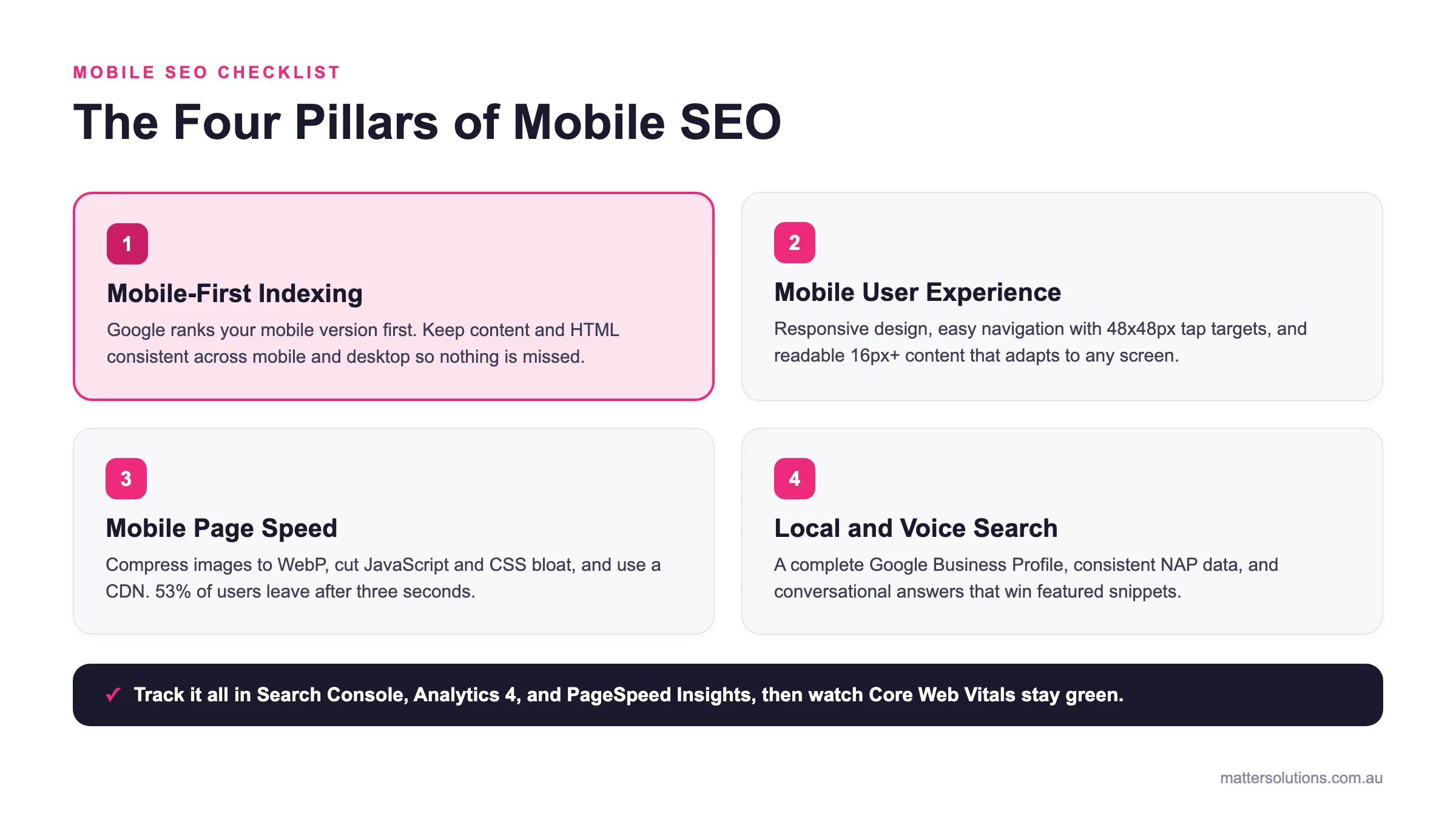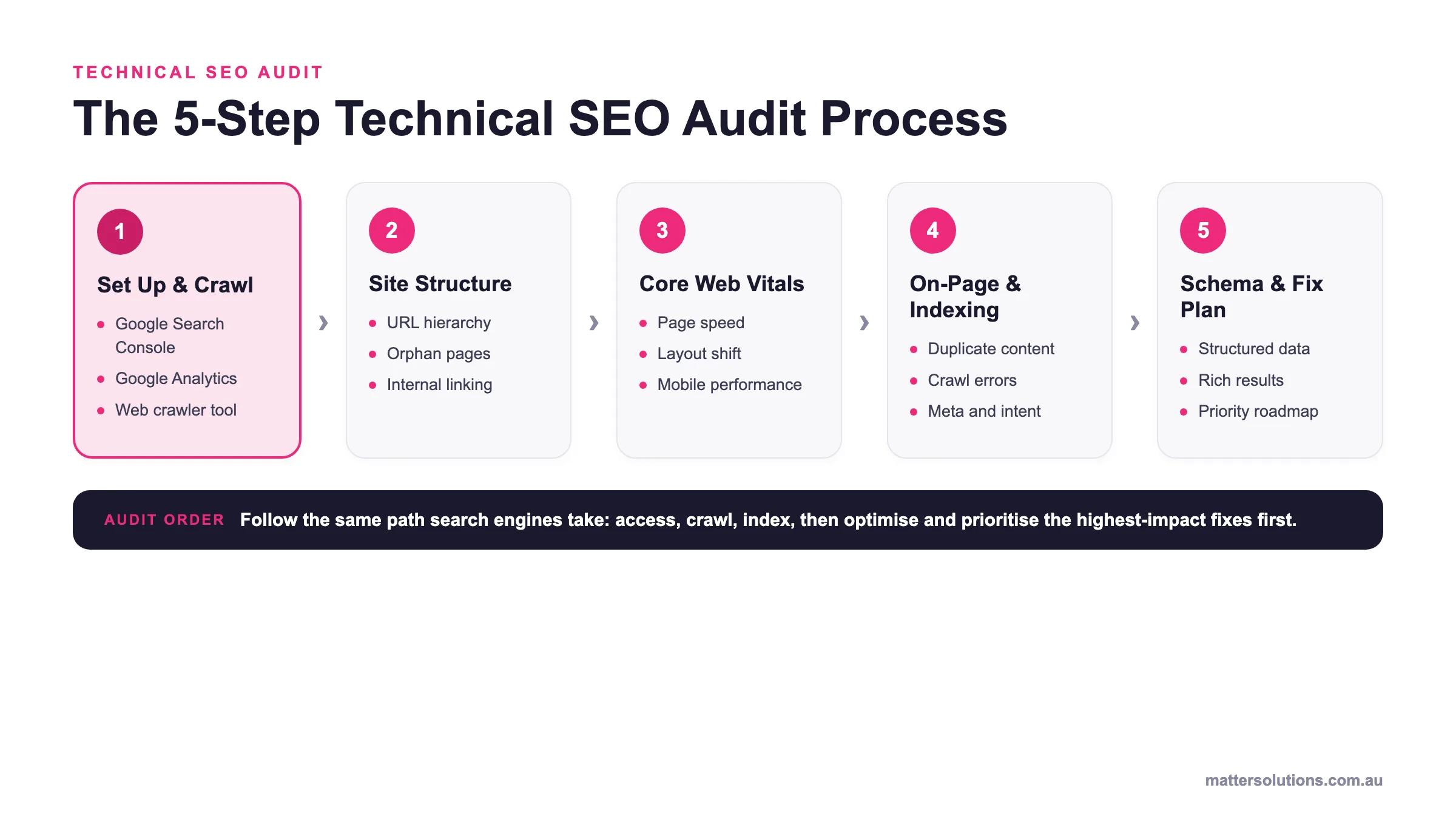
Nobody wants to lose paying customers to a broken mobile experience. Yet across Australia, businesses pour money into Google Ads while their mobile SEO quietly bleeds leads. In fact, poor mobile performance now affects a huge slice of global website traffic.
Here, we’ve broken down the most harmful mobile SEO errors to avoid, with practical tips on how to fix them. You’ll also get a clearer picture of what mobile users actually expect when they land on your pages.
If you don’t want your competitors pulling ahead, now’s the time to act. First, we’ll start with mobile-first indexing and what it means for the way Google ranks your site.
Mobile-First Indexing: What It Means for Your Site
Mobile-first indexing means Google crawls and ranks your mobile site first, so your desktop version is no longer the priority. This shift has been in place for a while now, yet plenty of businesses still design and optimise for desktop, almost as an afterthought for mobile.
Drawing from our experience, sites that treat mobile as a secondary concern tend to rank lower, even when their desktop version is well built. We prefer following Google’s guidelines on mobile-first indexing to make sure your mobile-friendly setup meets what Google actually expects.
Harmful Mobile SEO Mistakes That Cost You Rankings
Ever wondered why your Google Ads traffic isn’t converting? The problem isn’t always your ad; it’s often the page behind it. Some of the most harmful mobile SEO mistakes don’t show up in your ad dashboard at all.
That’s where technical SEO becomes worth its weight. Here are three specific areas where businesses trip up most often.
Are You Blocking Files from Google Search?
One of the most overlooked mobile SEO mistakes is accidentally blocking files that Google needs to crawl your pages. This happens when robots.txt rules block CSS, JavaScript, or image files from Googlebot.
Without access to these, Google can’t fully render your pages. So your pages look broken to Google, even when they display fine in web browsers for real visitors.
We’ve seen this time and again with sites that unknowingly restrict user access to certain resources through overly broad disallow rules. Request dynamically generated URLs with care, too, because if Googlebot can’t reach your mobile URLs, it simply won’t index them.
The solution is pretty simple: check your technical SEO setup regularly to catch blocked files before they quietly cost you rankings.
Core Web Vitals: The Scores That Shape Your Rank
Core Web Vitals are Google’s way of measuring real-world page experience across loading, interactivity, and visual stability. They’re a confirmed ranking factor, so weak scores push pages down in Google search results.
Based on our firsthand experience, most businesses aren’t aware that their core web vitals scores are poor until they run a proper audit. By that point, the rankings have already taken a hit.
Along with hurting your search rankings, poor user experience on mobile also signals to Google that your site speed and overall performance aren’t up to scratch.
Internal Linking Errors on Mobile Pages
Internal linking on mobile gets messy when desktop and mobile URLs aren’t treated consistently. If your mobile site skips links that exist on the desktop version, Google gets an incomplete picture of your structure.
Poor internal linking also leaves mobile users stranded on dead-end pages. With that in mind, always audit your mobile URLs separately to make sure every important page stays connected.
HTML code differences between your desktop and mobile templates can cause linking inconsistencies, too. These are the kinds of gaps that quietly drag down your overall SEO performance over time.
| Mobile SEO error | Why it hurts | The fix |
|---|---|---|
| Blocking files from Google | robots.txt rules that block CSS, JavaScript or images stop Google rendering your pages, so they look broken to Googlebot and may go unindexed. | Review your robots.txt and technical SEO setup regularly to catch overly broad disallow rules before they cost you rankings. |
| Weak Core Web Vitals | Loading, interactivity and visual stability are a confirmed ranking factor, so poor scores push pages down in search results and signal weak performance. | Run a proper audit before rankings slip, then improve load, interactivity and layout stability against Core Web Vitals thresholds. |
| Broken internal linking on mobile | When mobile skips links that exist on desktop, Google gets an incomplete picture of your structure and users hit dead-end pages. | Audit mobile URLs separately, keep templates consistent, and make sure every important page stays connected. |
Load Speed: How Slow Pages Drain Your Ad Budget
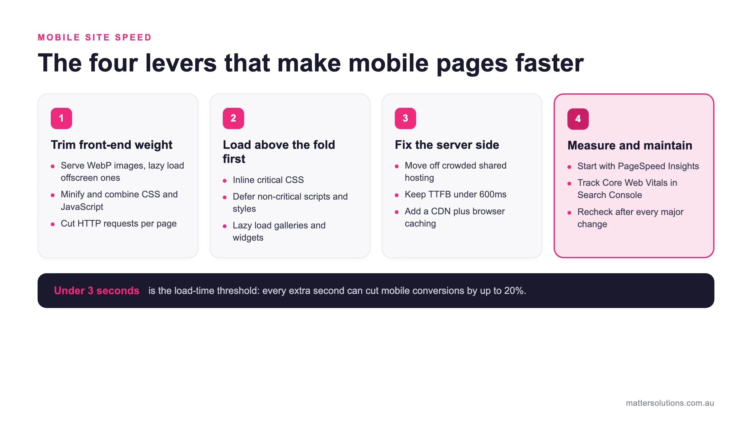
When you fix your load speed, you’ll immediately stop paying for clicks that bounce before your page even loads. Slow site speed is one of those problems that drains your Google Ads budget without making a single noise.
According to Google’s own mobile speed score data, 53% of mobile visits are abandoned when a page takes longer than three seconds to load. The average user won’t wait, and honestly, why would they?
Poor page load speed also pulls down your Quality Score in Google Ads, so you end up paying more per click for worse placement.
So naturally, compressing images and cutting server response time are two direct ways to lift your website’s performance fast. Accelerated mobile pages can help too, particularly for content-heavy pages where slow site speed hits hardest.
Keyword Research Gone Wrong on Mobile
Recent figures show 77% of mobile searches end without a click to any website. Even after knowing this, most businesses still build their keyword strategy around desktop behaviour. If your SEO strategy isn’t built around how mobile users actually search, you’re already behind.
Let’s break down where keyword research goes wrong on mobile:
- Chasing Desktop Search Patterns: Mobile users search differently from desktop users. They use shorter, punchier queries and rely heavily on voice search, so targeting desktop-heavy phrases means your content won’t match real search intent. Conversational, local queries are what drive results here.
- Skipping Long Tail Keywords: Long tail keywords perform particularly well in mobile search results because they mirror how smartphone users actually phrase their queries. In a mobile-first world, a search like “best SEO agency near me” will almost always beat a broad term in relevance and conversion. Skipping them is a costly oversight.
- Ignoring Local Search Intent: Mobile users are often searching on the go, and a big chunk of those searches carries local intent. Yet plenty of businesses running Google Ads overlook local keyword research entirely. Our findings show that location-based campaigns with locally optimised keywords consistently outperform those built purely around search engine results pages data.
- Missing Voice Search Opportunities: Voice search queries are longer, more conversational, and far more specific than typed ones. If your keyword research doesn’t account for how people speak their searches into a phone, you’re leaving a growing slice of mobile SEO traffic untouched.
Look, keyword research for mobile isn’t rocket science. But you must approach it with a completely different mindset from a desktop if you want it to actually work.
What Google Really Wants from a Mobile-First Site
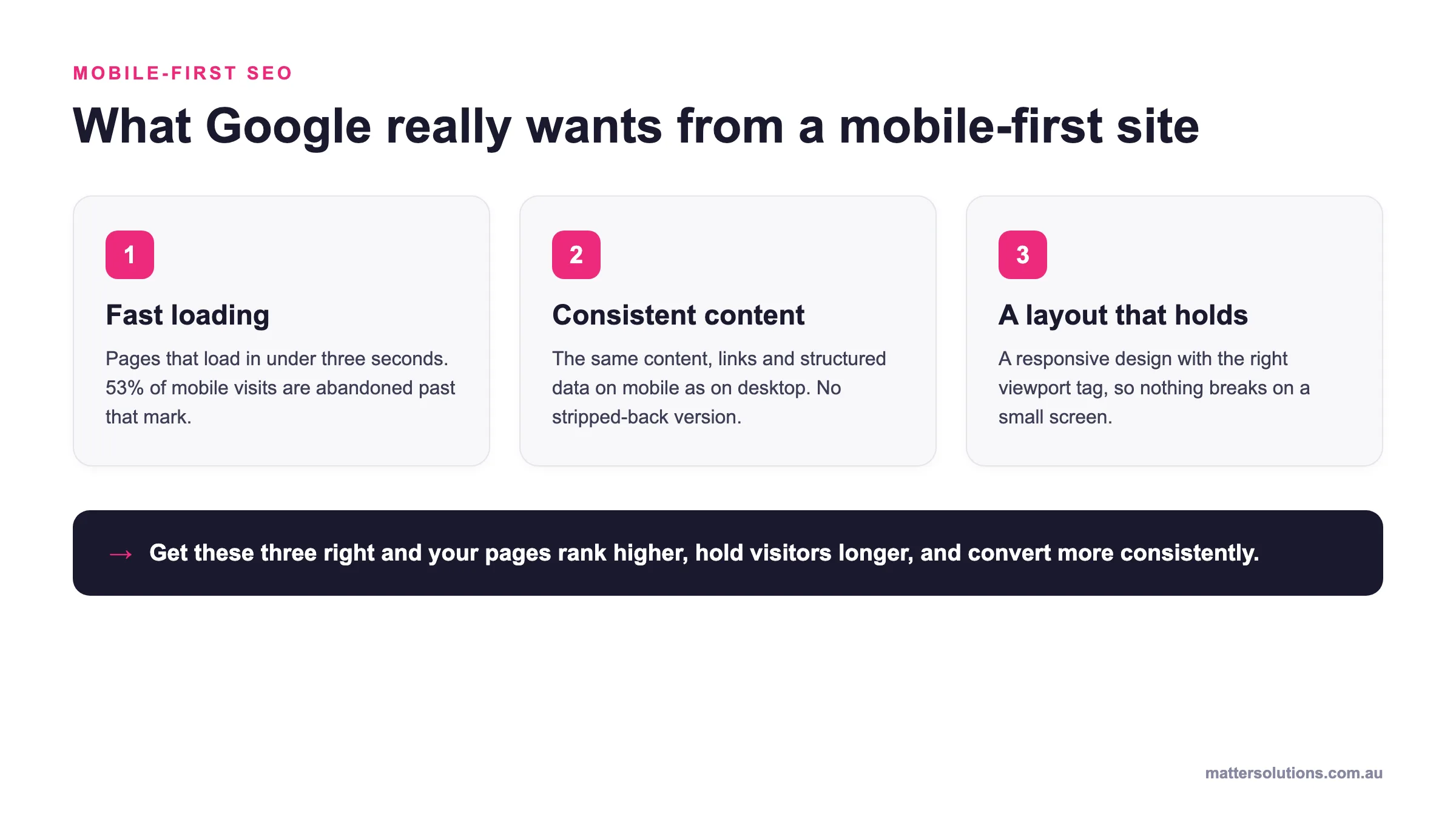
Google doesn’t expect much from your mobile site. All it wants is fast loading, consistent content, and a layout that doesn’t break on a small screen. Once you get these right, your pages rank higher, hold visitors longer, and convert more consistently.
Here’s a closer look at the three areas that trip businesses up most:
Mobile-first SEO
What Google really wants from a mobile-first site
Fast loading
Pages that load in under three seconds. 53% of mobile visits are abandoned past that mark.
Consistent content
The same content, links and structured data on mobile as on desktop. No stripped-back version.
A layout that holds
A responsive design with the right viewport tag, so nothing breaks on a small screen.
Get these three right and your pages rank higher, hold visitors longer, and convert more consistently.
The three things Google expects from a mobile-first site: fast loading, consistent content, and a layout that holds on small screens.
Page Layout and the Mobile Experience
Lots of businesses overlook poor mobile design, which comes down to on-screen clutter. Too many elements, oversized buttons, and pop-up ads make pages hard to use on smaller screens. You have to understand that mobile users aren’t sitting at a desk with a wide monitor. They’re on the go with limited patience, so cluttered pages lose them fast.
A site responsive to different screen sizes starts with getting your viewport meta tag right. This viewport meta tag tells web browsers how to adjust the page’s basic dimensions and scale for each device. Without it, your desktop site simply renders at full width on a phone, and that isn’t the desktop experience you want mobile users to have.
Enable user scaling where possible, too, since device-independent pixels help browsers render your layout cleanly across different mobile devices.
Image Optimisation on Small Screens
Oversized, uncompressed images are one of the quietest killers of mobile SEO performance. They slow your mobile site down, push up bounce rates, and frustrate users before they’ve read a single line. Through our hands-on experience, image issues are among the first things we spot in a mobile SEO audit.
Designing responsive websites means scaling images properly for each screen size, not just shrinking a desktop-optimised version. In fact, serving correctly sized images alone can cut page weight significantly.
Does Your Mobile Page Match Your Desktop Content?
Google expects the same content on both your mobile version and your desktop site. If your mobile site’s homepage is missing sections, links, or structured data that appear on the desktop version, your rankings take a hit.
Private content hidden behind tabs or accordions on mobile can also cause parity issues. More importantly, desktop and mobile shouldn’t be treated as separate desktop experiences with different messaging or page structures.
We’ve seen this time and again: sites that strip back their mobile version to “keep it simple” end up with weaker rankings across the board.
Common SEO Mistakes in Digital Marketing Campaigns
Most digital marketing campaigns bleed budget because the mobile experience behind the ad simply isn’t up to scratch. Take a look at some of the most common SEO mistakes businesses make when running mobile campaigns:
| Mistake | Why It Hurts |
|---|---|
| Sending ads to desktop optimised versions | Mobile user mistakenly lands on a page built for a wide screen and leaves immediately |
| Using separate desktop and mobile URLs inconsistently | Equivalent mobile URL issues confuse Google and split your ranking authority |
| Ignoring app install banners provided by default | These push real content down and frustrate users on smaller screens |
| Poor mobile design, lots of businesses overlook | On-page clutter and slow load times kill conversions before they start |
| Mismatched desktop pages and mobile versions | The same content isn’t served across both, so Google ranks the wrong version |
Honestly, these aren’t rare edge cases. Our findings show that the most common SEO mistakes in digital marketing come down to one thing. Businesses drive digital growth through paid ads without ever checking what happens after the click.
That oversight shows up fast. Poor Quality Score ratings follow quickly when mobile URLs serve a broken or slow experience. Web traffic drops, search rankings slip, and the ad budget quietly disappears with little to show for it.
Tips for Keeping Your Mobile SEO on Track
Now that you know the most common errors, here are a few practical habits that keep your mobile SEO clean and consistent:
- Run mobile usability tests via Google Search Console monthly
- Review core web vitals scores after every algorithm update
- Monitor site speed with Google Search Console regularly
- Schedule a mobile SEO audit every few months
SEO success on mobile comes down to consistency. These small checks keep your mobile-friendly setup sharp, your website’s SEO healthy, and your rankings stable over time.
For example, a Brisbane retail client we worked with had no idea their mobile-first setup was broken until a routine Google Search Console check flagged 47 pages with mobile usability errors. Their site speed had quietly dropped, too, pushing their Quality Score down across every active campaign.
After fixing those issues, their mobile SEO improved noticeably within six weeks. Honestly, it didn’t take a full rebuild. It took a mobile SEO audit and a bit of attention. Most mobile SEO issues are far easier to fix than businesses expect, and the sooner you catch them, the less damage they do.
Stop Losing Clicks: Start Fixing What Counts
Once your mobile SEO is properly sorted, your Google Ads budget starts working harder, and your leads follow. Small fixes, done consistently, drive real improvements without a full site rebuild.
Mobile first isn’t a trend anymore; it’s the baseline Google holds every site to. Businesses that treat mobile devices as an afterthought are paying for that choice every single day in wasted ad spend and lost search engine optimisation value.
At Matter Solutions, we help businesses identify and fix exactly these kinds of issues. If your mobile site isn’t performing the way it should, contact Matter Solutions experts today for a free audit and a clear path forward.
Quick FAQs (Frequently Asked Questions) on Mobile SEO Errors
Next up, let’s cover the questions we hear most from businesses dealing with mobile SEO errors.
Do Mobile SEO Mistakes Affect Google Ads Performance Directly?
Yes, mobile SEO mistakes feed directly into your Quality Score. Poor user experience on landing pages raises your cost per click and lowers ad placement. It’s one of the most overlooked connections in digital campaigns.
How Long Before Google Recognises Mobile SEO Improvements?
Google typically recrawls updated pages within two to four weeks. To help your site achieve faster recognition, submit your sitemap through Google Search Console after fixes. Bigger sites can take slightly longer depending on crawl frequency.
Are Responsive Websites Enough to Avoid Mobile SEO Issues?
Responsive websites are a strong starting point, but they aren’t a complete fix on their own. An optimised mobile site also needs fast load times, correct content parity, and clean internal linking. Mobile-friendly design alone won’t cover all the gaps.
What Are the Top Mobile SEO Mistakes Businesses Make?
The top mobile SEO mistakes include blocked files, slow page speed, and inconsistent content across desktop and mobile. Not the desktop experience, but a properly built mobile version is what Google wants to see. Common mistakes also include broken internal linking and missing viewport tags.
Does My Mobile Homepage Need to Match My Desktop Content?
Yes, your mobile homepage must carry the same content as your desktop version. Google checks for content parity, and gaps in structured data or links hurt rankings. Device-independent pixels also affect how your mobile website renders across different screens.
How Do I Spot a Poor User Experience on Mobile?
Google Search Console flags mobile usability issues directly inside your account. High bounce rates and low session times are also strong indicators of poor user experience. Running a Core Web Vitals report gives you the clearest picture of what needs fixing.
What Does a Well-Optimised Mobile Site Look Like?
A well-optimised mobile site loads in under three seconds, serves the same content as the desktop site, and has no on-screen clutter. It passes Google’s mobile-friendly test and scores well across Core Web Vitals. Achieving common mistakes-free status across all three areas puts you well ahead of most competitors.
Need help with your digital marketing?
Book a free strategy call and let's discuss your goals.
Book a Strategy Call