Ensuring your website converts hugely depends on your ability to engage web visitors. And, if you look at the research surrounding people's online behaviour, you'll discover that investing in your site header could allow you to significantly boost site performance.
Firstly, data shows that people spend more than half of their web-browsing time looking at the first screenful of a site. The impact of your site header becomes even greater if you consider further research on web-browsing behaviour.
For example, we know that people form first impressions about sites within 50 milliseconds, effectively impacting their decision to convert. Moreover, research from Yahoo suggests that the first place people's eyes land on a site is the top left corner of the page (aligning with Nielsen's claim that most people look at web pages according to the F-pattern).
So, if you're looking for effective design strategies for site headers to boost website engagement, here are a few best practices to help you capture and retain your audience's attention and convince them to convert.
Make Your Value Proposition Clear and Relevant
What do consumers want from your brand? At the end of the day, they expect a solution to a pain point they're experiencing. However, while you may offer a product or service that genuinely benefits your target audience, you can only capture your prospects' attention if you know how to market that solution.
With this in mind, one of the most essential design strategies you can apply to your site header is understanding how to present your value proposition.
First and foremost, do your best to prove that you comprehend and care about your audience's needs. Research from Adobe reveals that 78% of people think that brands need to show they understand and care about their customers if they are to consider purchasing. So, as you approach the design process for your website header, try to design it in a way that shows your organisation's commitment to solving your target audience's needs.
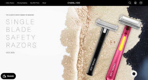
For example, one excellent way to do this is to use the hero section of your site to address a common pain point your solution removes. If you check out OneBlade, you'll see that in advertising "the closest shave known to mankind," it does precisely this — the brand identifies its target audience's pain point and sets the scene to show how and why it's got the best solution.
Do you operate in an industry or niche slightly more complex than basic personal hygiene? In that case, you'll need to consider product understanding when designing your site header. Try exploring design elements that will increase product comprehension while allowing you to deliver a clear and relevant value proposition.
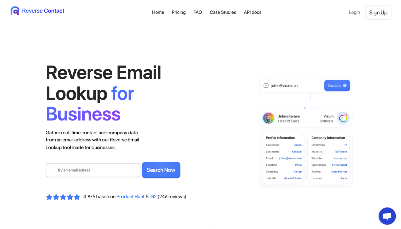
For instance, if you check out the Reverse Contact header, you'll see that it includes a clear value proposition and an in-app screenshot to instantly demonstrate the product's capability and value.
In addition to presenting web visitors with a value proposition that promises to remove their frustrations or fulfil their aspirations, do your best to back up your claims with evidence. Especially when trying to engage consumers who are on the fence about investing in your solution.
Creating a site header that appeals to your target audience's emotions is great. After all, a large portion of people's purchase decisions are influenced by subconscious motivations. Nonetheless, to maximise your site's engagement and sales potential through credibility, you should also provide evidence of your ability to solve consumer pain points.
With this in mind, make your header promises measurable whenever possible. And no, you don't have to make impressive claims to convince prospects to convert. All you have to do is show that your organisation offers a solution that's been proven to work.
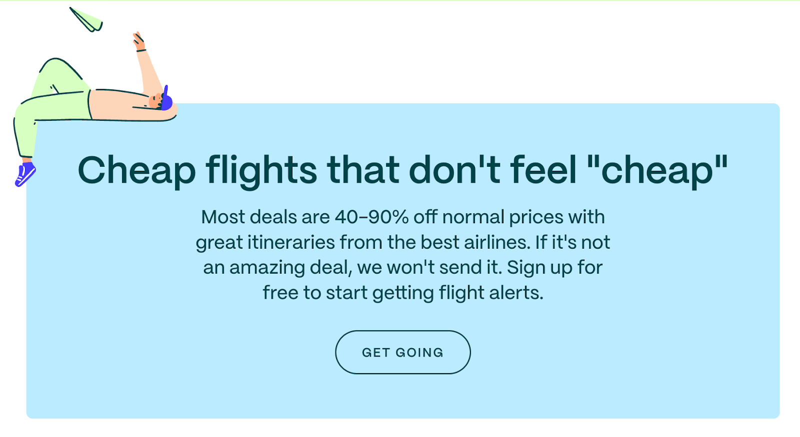
For example, check out this Going page. This brand states that its service allows users to find flight deals "40-90% off normal prices." Note how the value proposition doesn't advertise the best possible outcome of signing up. Instead, it provides a range of savings new customers can achieve, properly setting prospects' expectations and convincing them to try Going's solution.
One of the easier ways to upgrade your site header to boost website engagement is to re-think your design decisions regarding the high-value elements in the topmost section of your website.
And, no, this doesn't necessitate elaborate (or expensive) design changes. Ultimately, even tiny visual tweaks can help transform a site element into an attention-grabbing, conversion-inspiring feature.
For example, something as simple as surrounding your value proposition and CTAs with sufficient negative space can help these elements stand out.
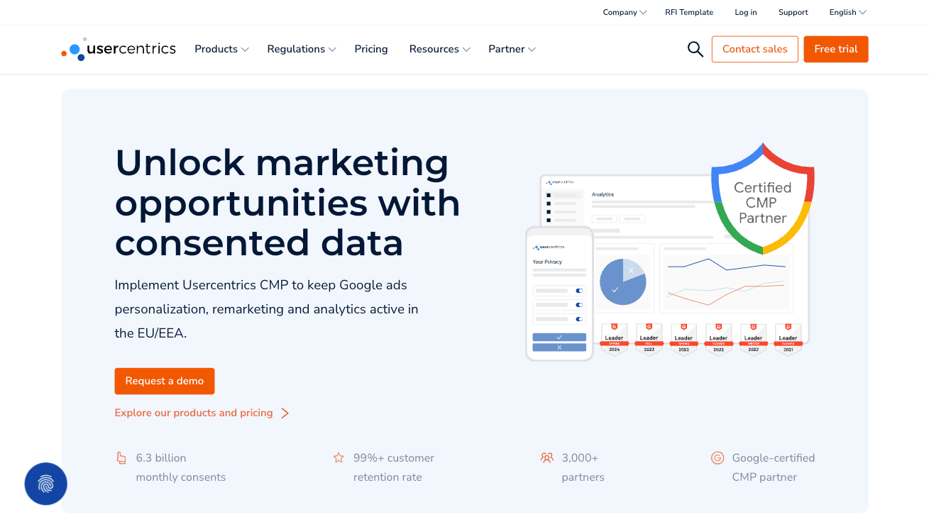
Or, you can do something similar to Usercentrics and employ colour to engage your audience. Note how this SaaS brand uses the colour orange to encourage free trial sign-ups — a highly logical design strategy, considering that orange is a complementary shade to the light blue used for the background of the header section.
Do you know how today's consumers make purchase decisions? When trying to ensure they get the best solution to their needs, people generally conduct online product/service research. Then, they go on to buy via their preferred channel.
But while this data shows how essential it is for businesses to provide proof of their competence to solve consumer pain points, it also reveals a simple strategy for maximising website engagement during the pre-purchase stage of the buyer's journey. The info shows just how essential it is for brands to prove that they are, indeed, the most qualified entity to help prospects solve pain points.
One excellent way to accomplish this goal is to use your website header to double down on everything that sets your brand apart from its competitors.
Highlight any unique selling points. Address the specificity of your offer. Don't try to spread your messaging too thin across many concepts. Instead, stick to what sets your product apart and hit the note hard.
For a great example of how you can do this, check out Transparent Labs. This brand uses multiple visual elements to highlight its products' "natural" aspects. It says that the ingredients are "natural and grass-fed" and points out that the supplements contain no artificial sweeteners or colouring. Moreover, the brand emphasises that each formula is clinically dosed and third-party tested, using trust signals to further underline its credibility as a business that puts customer safety before profits, unlike many others in the fitness and health industry.
Sometimes, designing an engaging and conversion-inspiring site header isn't about the claims you make. Instead, it's got more to do with how effectively you can demonstrate that you have your audience's best interest at heart.
If you look at why consumers don't trust brands, you'll find that most people see businesses as profit-oriented. For instance, Gen Z thinks a brand's values must align with their own to trust it. Moreover, research shows that consumer trust reduces by 144% when consumers believe a company uses AI, highlighting the importance of human connection when engaging clients.
In addition to working on your organisation's credibility, one way you can improve the effectiveness of your site is to lower the stakes on CTAs — especially in the header section, which is the first part of your page people see.
By employing microcopy to point out that your visitors don't have to commit to anything in the early phases of their buyer's journey, you can effectively encourage them to enter the mid or lower stages of the sales funnel without risking the possibility of losing their trust.
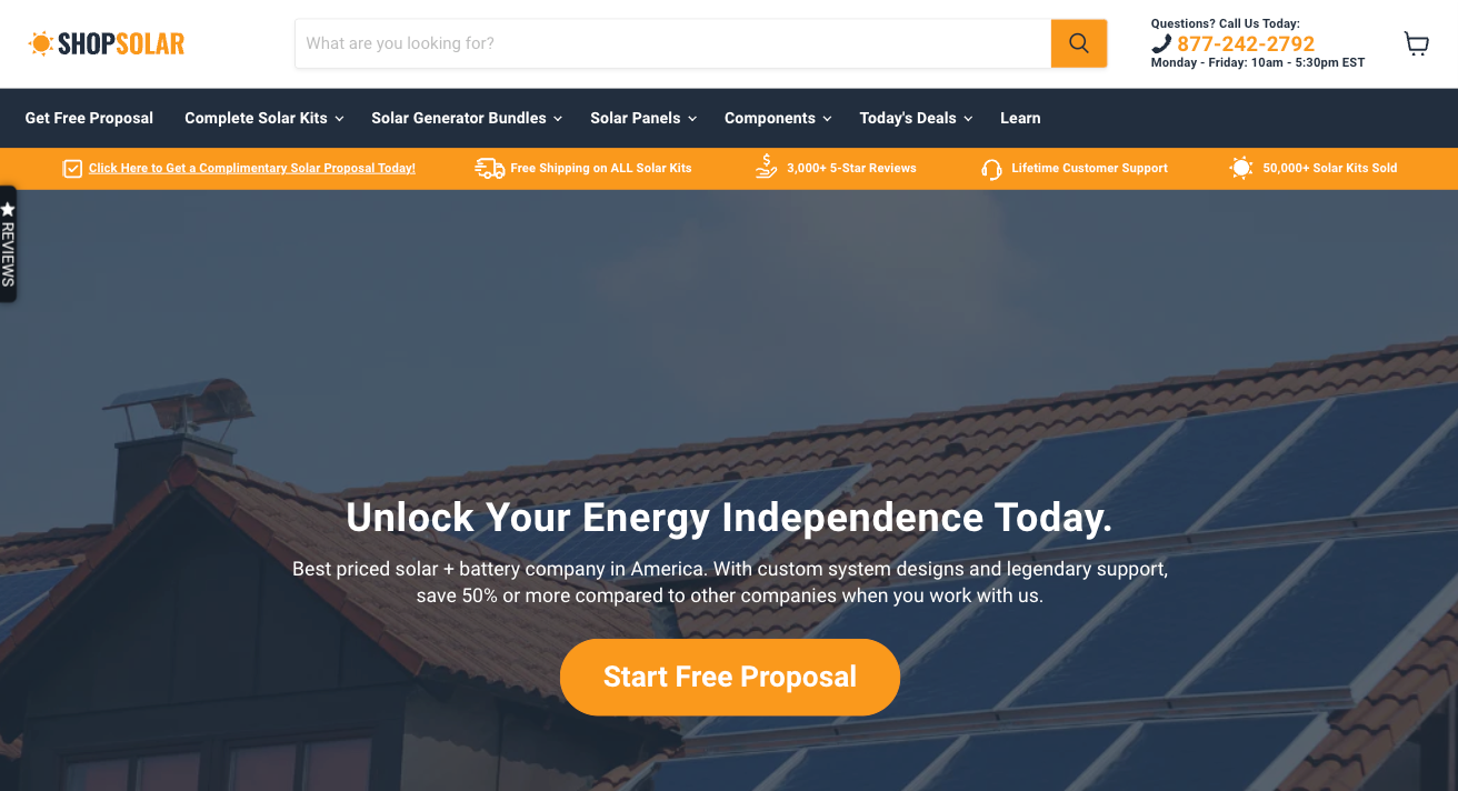
Check out how ShopSolar does it on its site. Instead of inviting web visitors to "shop" or "browse," this business encourages prospects to "start a free proposal." This wording doesn't just communicate that they'll receive a personalised offer. More importantly, it emphasises that the offer doesn't require a commitment, making it much more likely that people will convert into leads.
Another great way to instantly engage your web visitors and encourage them to convert is to enrich your website header with urgency elements.
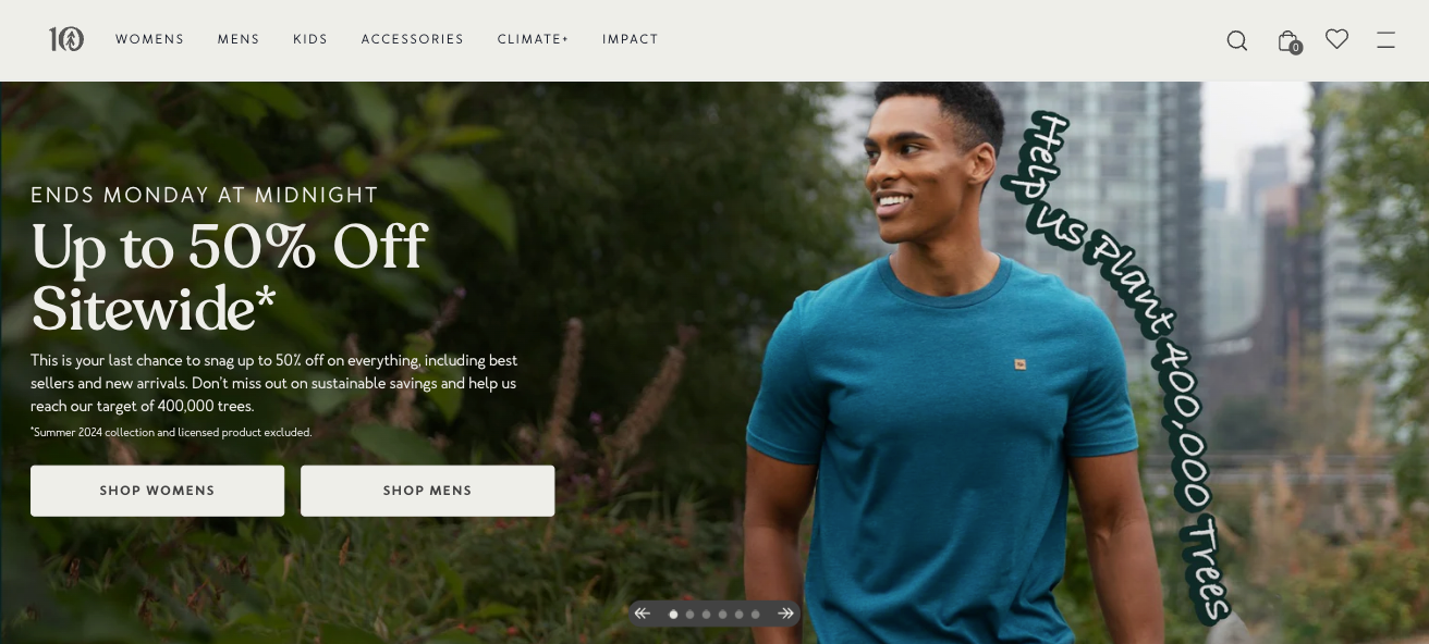
For instance, consumer psychology research states that most people will increase their purchase intention if they're presented with a deadline. So, doing something similar to Tentree and stating that web visitors can get 50% off until a pre-set date can be a great way to engage potential buyers and encourage them to move closer to a conversion.
Or, if you don't want to rely on offering discounts to engage your target audience on your website, you can explore alternative ways to create a sense of FOMO, whether by pointing out scarcity or leaning into the hype surrounding your newly released solutions.
Provide Instant Access to Core Functionality
Sometimes, the best way to use your site header isn't to make promises and claims. Instead, it's to let your product speak for itself. After all, if it delivers unmatched value, works seamlessly, and is easy to use, it's guaranteed to win over your target audience.
One excellent way to engage web visitors — especially those who aren't yet familiar with your brand and solution — is to provide instant access to your product's core functionality. This engagement-boosting strategy works because it allows you to deliver your value proposition and immediately back it up with proof.
Plus, interactive website elements are highly engaging (52.6% more engaging than their static counterparts, to be precise), making them the ideal website header element to play around with.
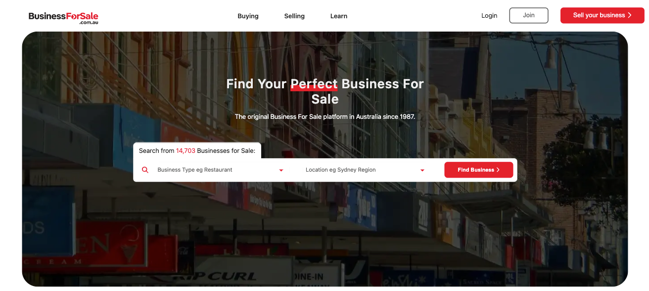
One excellent way to incorporate this design tactic on your website is to do something similar to Australian Business for Sale. This brand offers a database of for-sale companies in Australia. But, instead of forcing buyers to browse through thousands of listings, Australian Business for Sale allows web visitors to search for the type of brand they're interested in acquiring, making the entire purchase process fast, convenient, and, most importantly, user-friendly.
Last but not least, as you explore the site header design strategies that will help you engage web visitors, don't forget that, in most cases, retaining your audience's attention comes down to convincing them that they can trust your business.
Now, if you look at how most buyers evaluate brands, you'll find that social proof plays a tremendous role in convincing people to put their confidence in an organisation. In fact, over 99% of people read reviews to inform their purchase decisions, so emphasising these elements in the most prominent section of your website could be the best way to encourage engagement, inspire conversions, and speed up your prospects' movement through the sales funnel.
The best part about emphasising social proof is that there are almost endless ways to do it, meaning you can opt for a result that aligns with your site's visual appearance and your brand's personality.
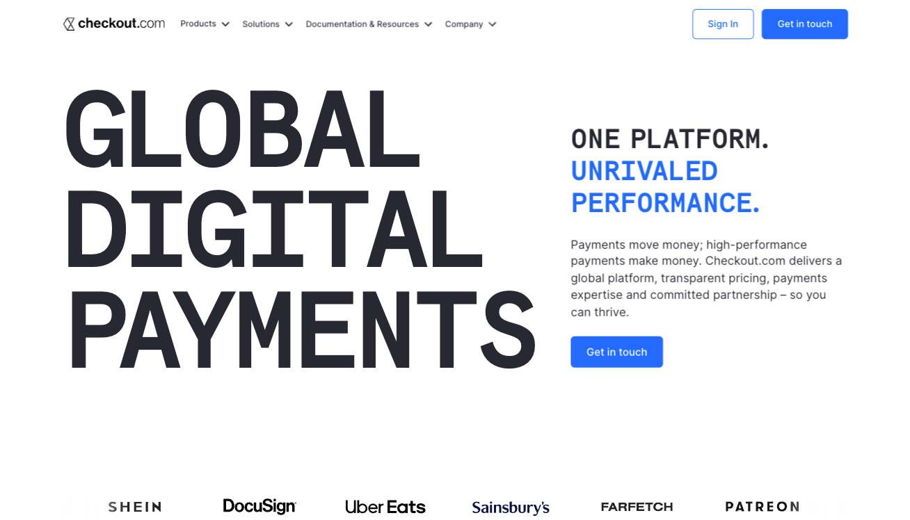
For example, the bottom part of the Checkout header features the logos of the brand's most famous customers, building brand credibility via association.
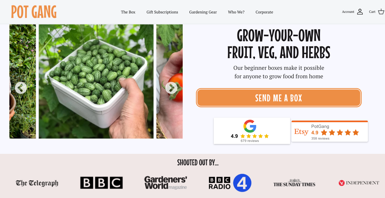
On the other hand, Pot Gang takes a slightly more traditional approach. The brand shows off Google and Etsy ratings, knowing that these two instances of social proof say more than enough about the reliability of its products and services.
Designing a perfect site header — even one that performs exceptionally well — doesn't have to be challenging. Ultimately, creating an engaging and conversion-inspiring website depends on understanding your audience's needs and your willingness to prove that your brand offers the best solution to their pain points.
The design strategies outlined in this article are all excellent ways to achieve your goals. Don't hesitate to customise them to your brand's (and prospects') needs to ensure you're getting the highest engagement (and consequently conversion) rates you can.
Karl Kangur is a serial entrepreneur who founded his first online business as a teenager. He’s a digital marketing expert and loves talking about trends and best practice in this space. When he’s not doing any of these things, he’s probably at the gym preparing for his next competitive bodybuilding event.